Role and team
Sprint Master (Microsoft), Product Owner (Volkswagen), UX Designer (Me), Developer (Microsoft), Research & Test Users (Volkswagen & Microsoft)
The Challenge: Unlocking Productive Commute Time
The Car Commuter Problem

Train Commuters Have It Better (and Worse)
Design Process
We structured the 10-day sprint around the Product Thinking methodology: understanding the problem deeply before jumping to solutions, validating vision and strategy, then rapidly building and testing.

1 Discover
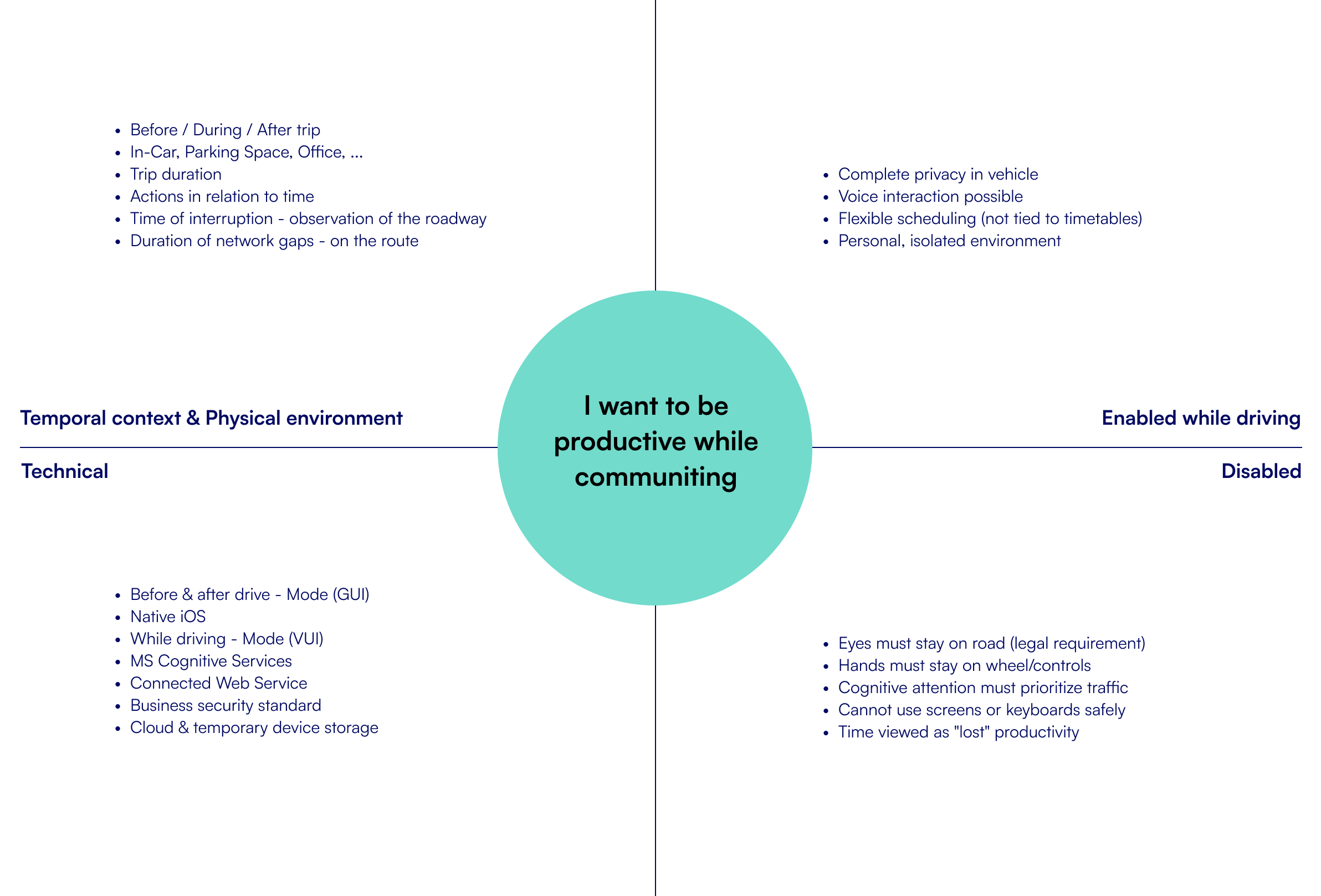
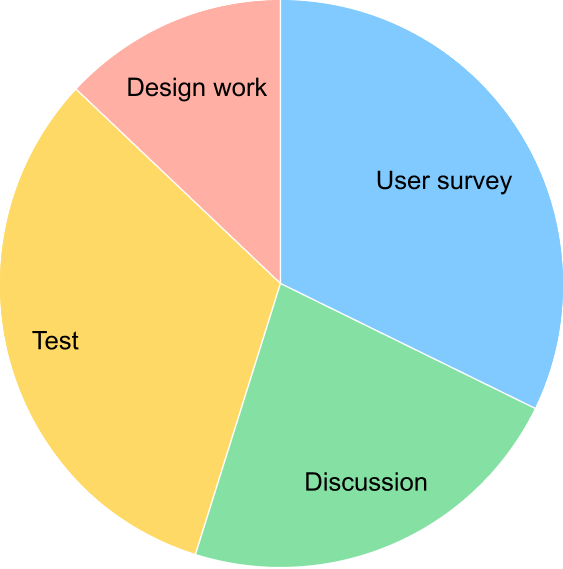
User Problem: Facilitated discussions about what the problem actually is, how it feels to users, problem magnitude, and whether solving it creates real value. Conducted context of use analysis and user surveys to understand commute patterns.
Target Audience: Identified segments within car commuters: daily long-distance commuters, occasional drivers, business travelers, parents on school runs – each with different productivity needs.
3 Build and Test
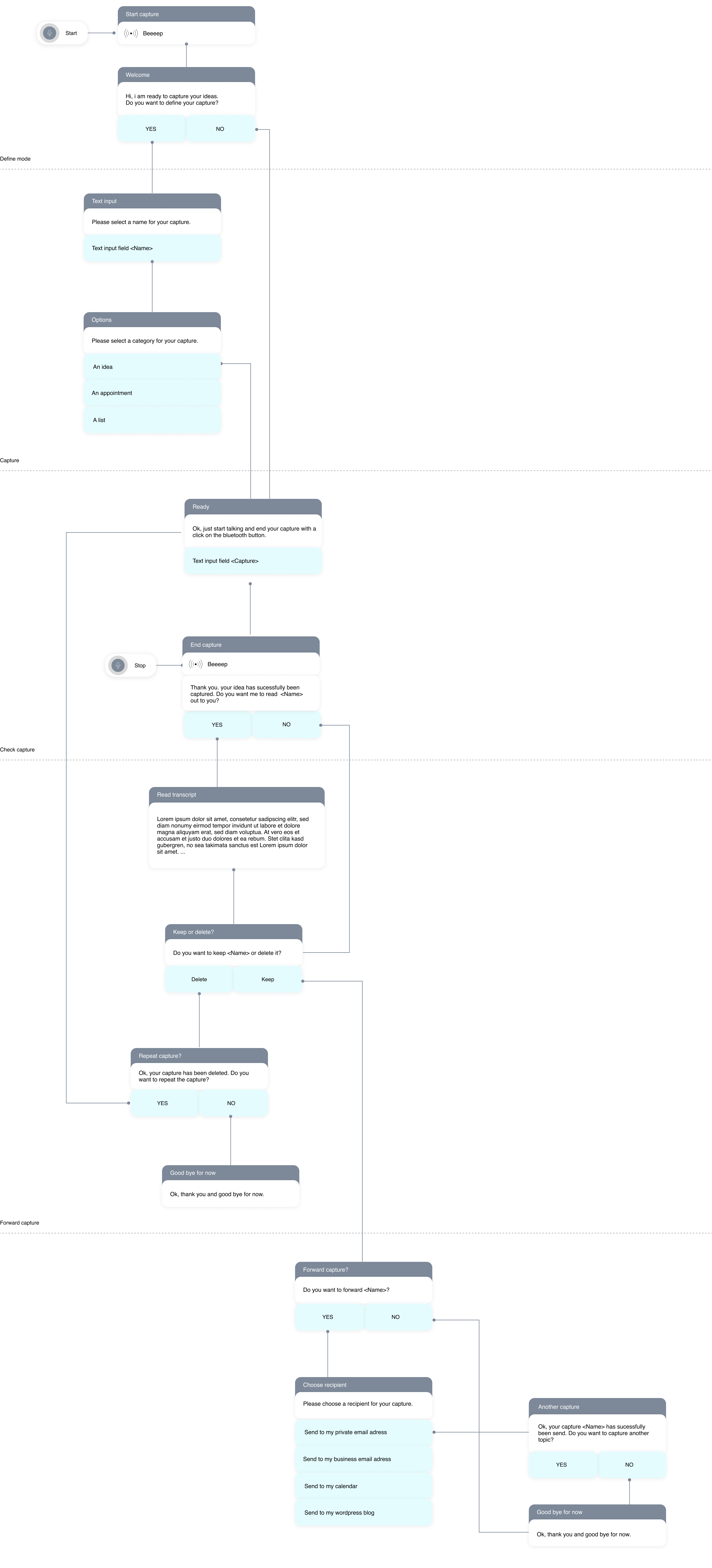
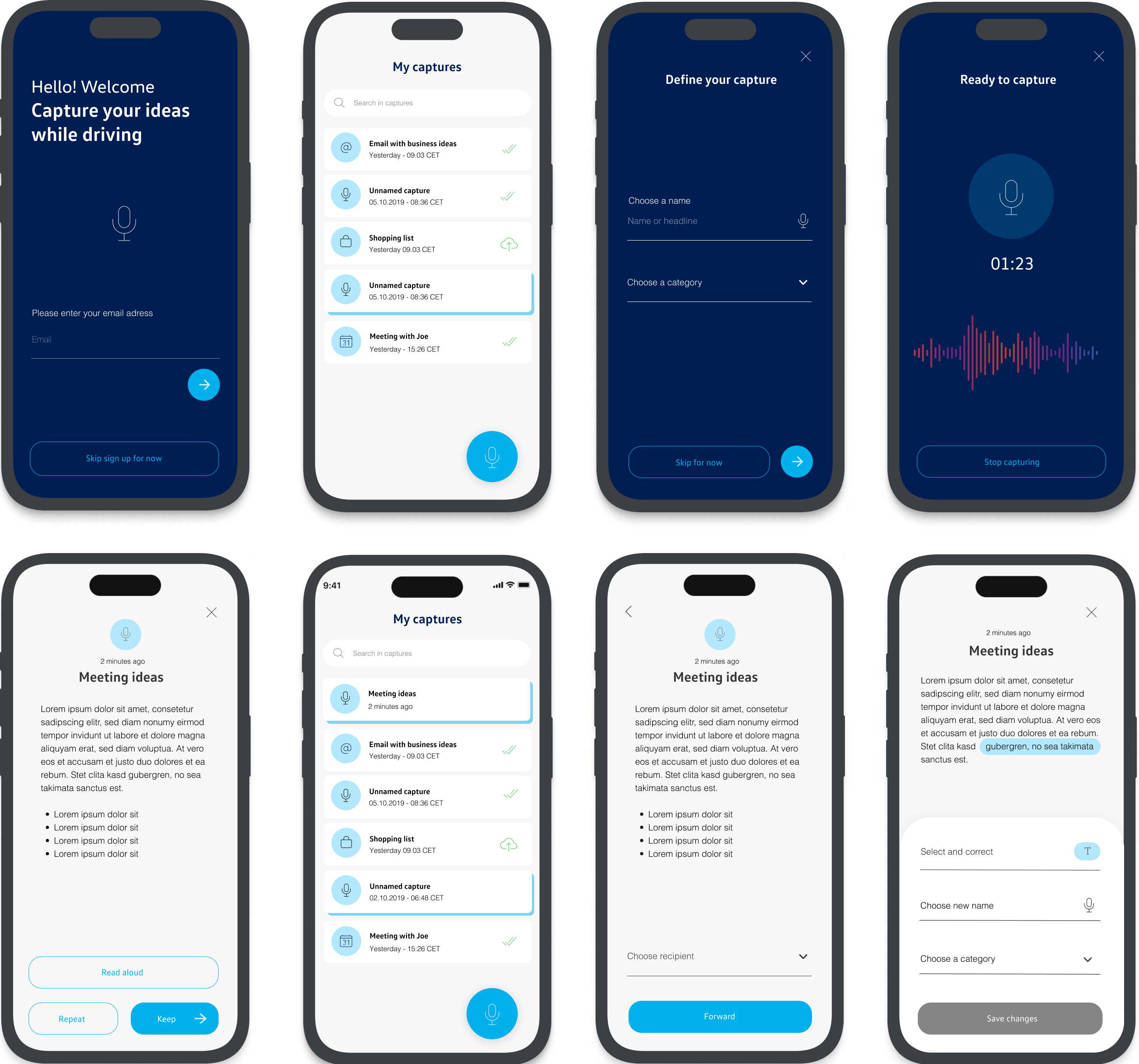
Sketched UX for four user scenarios based on main problem statements. Conducted task analysis of ideated flows. Created wireframes and dialog scripts. Built GUI in Axure and simulated VUI with pre-recorded Cortana phrases. Tested in real driving conditions with GoPro documentation.
Strategic Vision: The Road to Autonomy
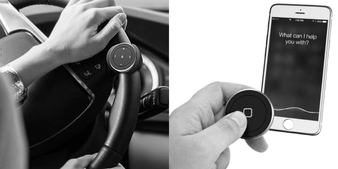
Strategic UX Decision: Users have full control over the listening mode. Unlike always-listening devices (Alexa, Google Home), our app requires manual activation via Bluetooth buttons. This addressed privacy concerns and gave drivers explicit control – critical for automotive trust.
Build & Test: Simulating Voice UX in Real Driving
We created four user scenarios aligned with our personas, then built prototypes combining graphical interfaces (Axure) with simulated voice interaction.
Test Setup
- Real driving conditions (not simulated)
- GoPro camera recorded full interaction
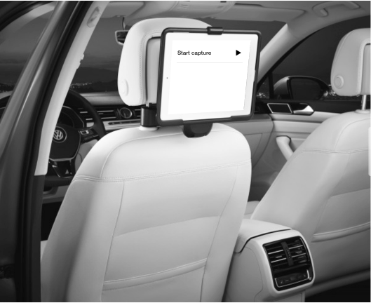
- GUI tested via clickable Axure prototype on tablet
- VUI simulated with pre-recorded Cortana audio
- Bluetooth button for activation control
- Post-drive interviews with participants
Key Findings: What We Learned from In-Car Testing
1
Seamless Cross-Modal Experience Desired
Users appreciated features but disliked the jarring transition from voice (while driving) to GUI (after parking). Starting a task via voice but needing to finish it on-screen created an unsatisfying „usage break“ that felt incomplete.
Implication: Voice-first design must consider the entire task lifecycle, not just the capture moment. Either complete tasks fully via voice, or design intentional hand-offs that feel natural, not forced by technical limitations.
3
Trial-and-Error Voice Exploration
Remember, this was 2016 – voice interfaces were nascent. Nearly every user entered a trial-and-error mode, testing boundaries and probing what commands the system understood. Users actively explored cognitive capabilities.
Implication: An initial voice menu providing guidance would have slowed task completion but reduced frustration and given users a better mental model of possibilities. Discoverability is critical in voice UX.
Personal Learnings
UX design is fundamentally a cognitive group process, not an individual creative act
Voice UX is Fundamentally Different
You can’t just convert screen workflows to voice commands. Voice requires rethinking information architecture, task flows, error handling, and user mental models from scratch. The modality shift demands new design patterns.
In 2016, we were pioneers figuring this out. Today’s voice-first design principles emerged from sprints like this.
Voice UX is Fundamentally Different
The 10-day limit and lack of planned iterations meant we had one shot to get insights. This constraint forced radical prioritization, scrappiness (pre-recorded audio!), and focus on high-value learning over polish.
Evidence doesn’t require perfection – it requires smart questions and good enough prototypes to get answers.


