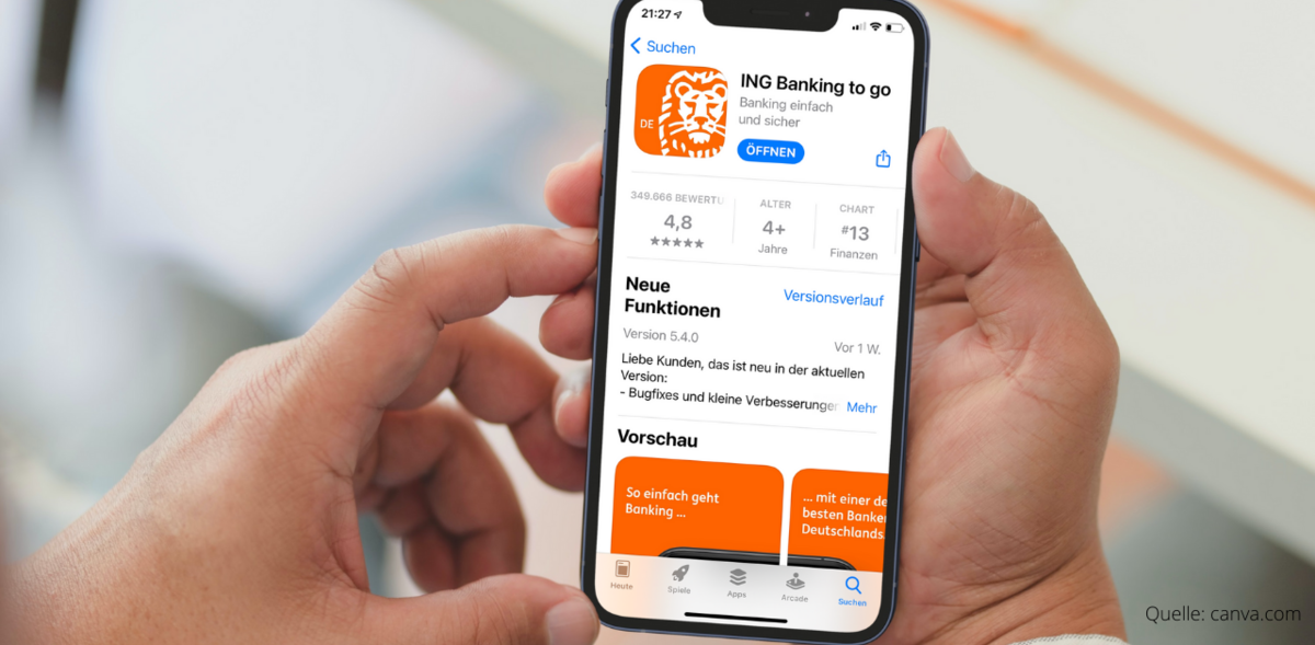
Redesigning a critical banking feature to reduce support calls, improve findability, and create feature parity between the web and mobile platforms.
The ING Germany mobile banking app serves millions of users who rely on the post-box to access critical financial documents — from account statements to investment updates. But feedback revealed real usability friction: customers struggled to find specific documents, confusion around the archive drove support calls, and the mobile experience lagged behind the web.
How do we design an inbox that meets the very different needs of users — from the casual user to the professional trader — while fulfilling the ING UX Design Metrics: personal, effortless, continuous, fair, surprising, engaging and supportive?
As UX Designer in the Service & Security Squad, I led the redesign of the post-box — introducing search and filter capabilities while fundamentally rethinking the information architecture to serve both casual users and power users who trade stocks and manage investments.
Guiding principle: better structure before more features. Give people system-level context and item-level clarity, so most can find documents by browsing — with search there when they need it.
Users had no indication of total document count, archive size or loading states during search. Lack of feedback created uncertainty about whether actions succeeded.
Archiving felt permanent with no clear undo. Users feared mistakes, which led to decision paralysis and support calls.
No confirmation for destructive actions and no auto-save of filter states — easy to navigate away and lose search context.
A flat list made every item look equally important — burying critical legal notices among routine statements.
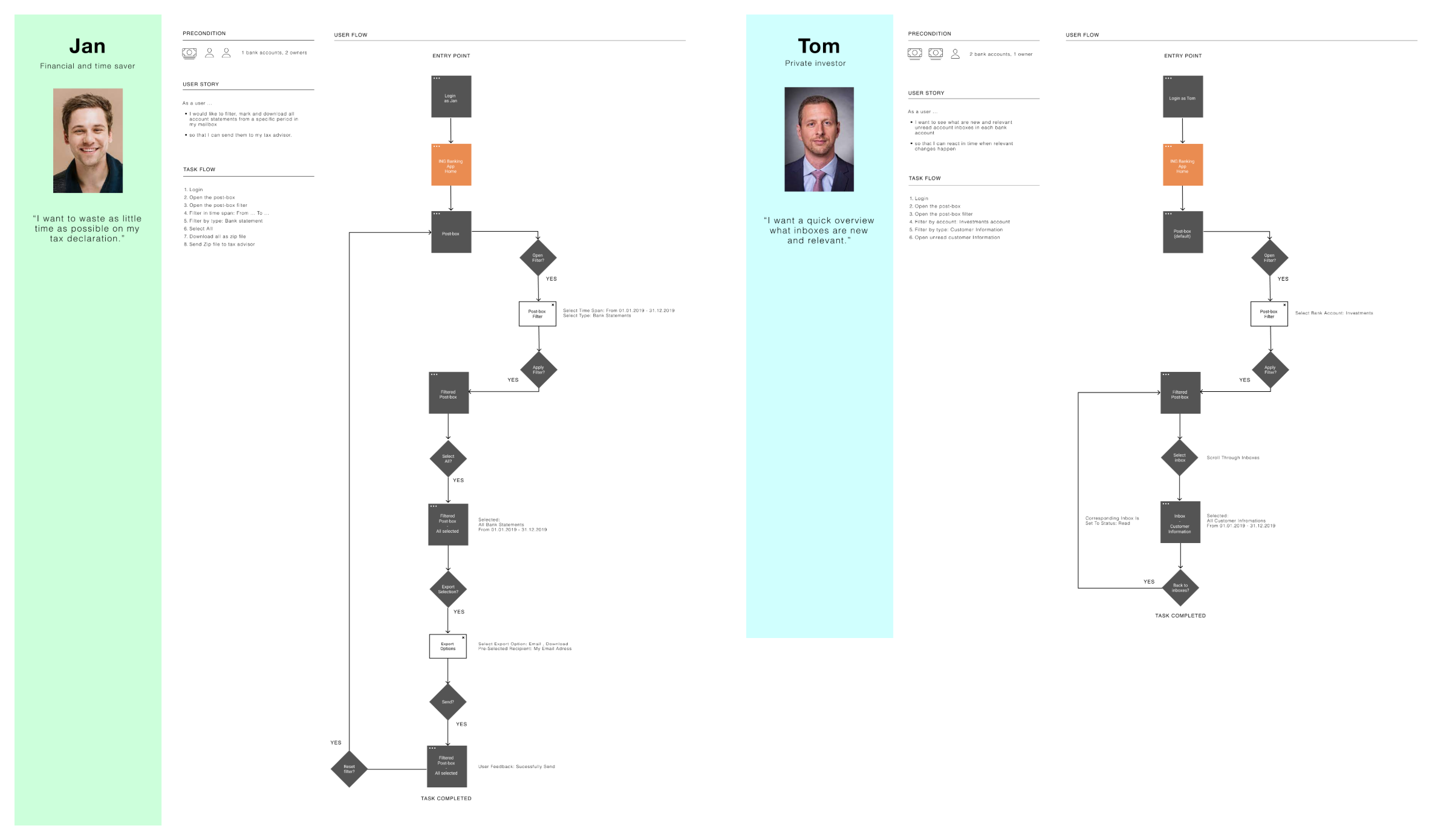
The two personas are the cornerstones of the spectrum of potential users — and they bring clarity to the overall complexity of the corresponding requirements. Jan wants to waste as little time as possible on his tax declaration; Tom wants a quick overview of what is new and relevant.
ING users give continuous feedback on the website and the banking app — rating the experience and answering open questions. In doing so, they surface pain points and desired new features.
The status-quo usability was evaluated through an expert review — heuristic evaluation, standalone design critique and an analysis of the taxonomy, navigation and user guidance.
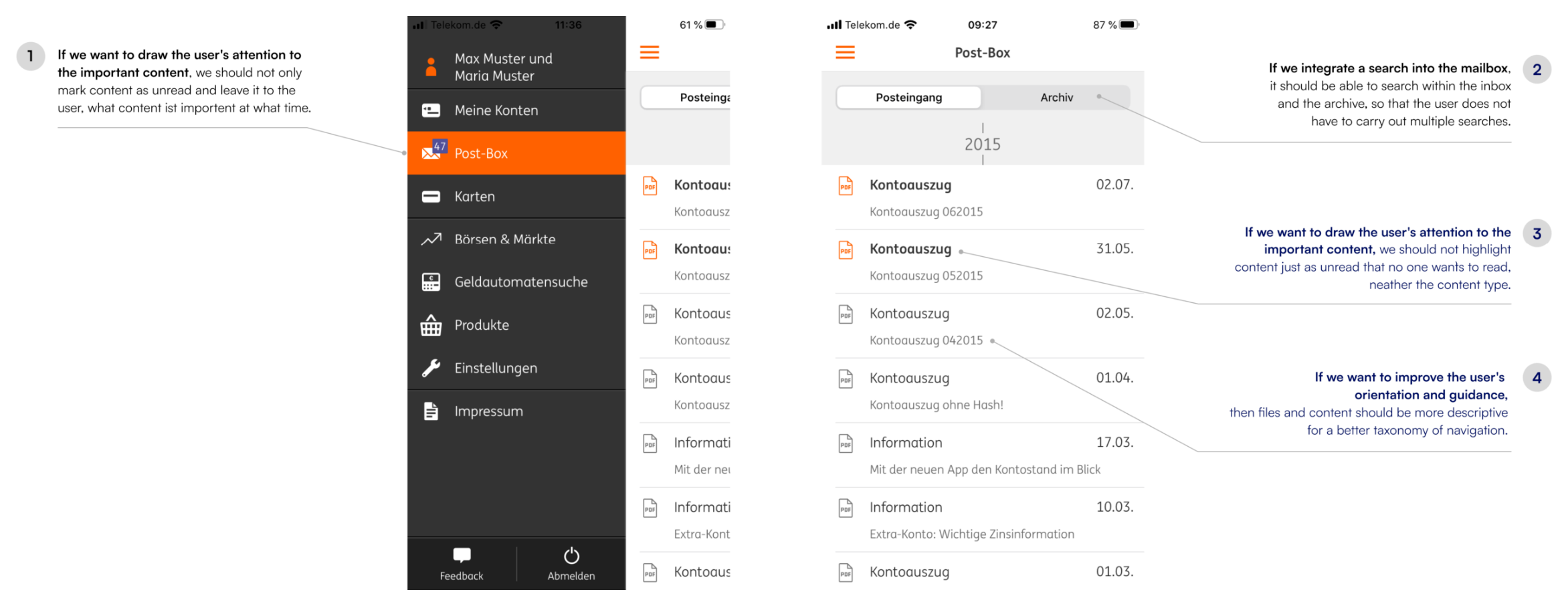
Keep users informed about what is going on, through appropriate feedback within reasonable time.
Users don’t know which inboxes they cannot delete for legal reasons, or when they can do so at the earliest.
Inbox items indicate whether they can be deleted — and if not now, at what time at the earliest.
Users often act by mistake. They need a clearly marked “emergency exit” to leave the unwanted action.
Confusion between inboxes that can be deleted and those that must be archived for legal reasons; naming isn’t descriptive.
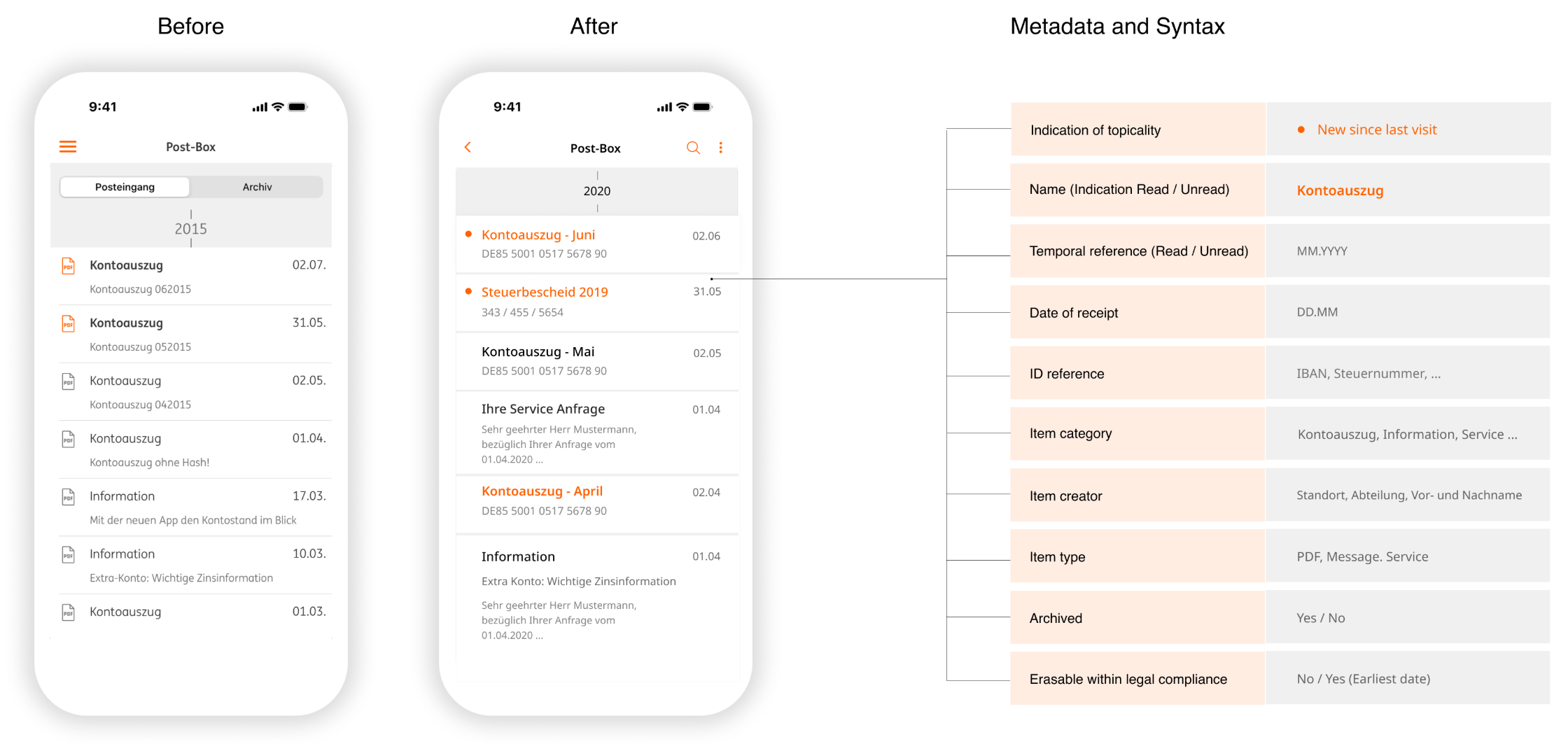
Remove the archive in favour of a “remember” function and a trash can users can restore from; supplement mail with a time reference and an ID such as IBAN or tax number.
The best designs prevent problems before they occur, or ask users to confirm before they commit.
A new search function cannot automatically search both inboxes and the archive.
Dissolve the archive and replace it with a trash can, so deleted content is findable again in one place.
Every extra unit of information competes with the relevant units and diminishes their visibility.
The counter shows all unread messages even when most aren’t relevant; file type as primary info adds no value on mobile.
Make the counter show how many mails arrived since the last visit; remove file type as primary information.
Search UX principle: Better information architecture reduces search dependency. By making documents more scannable and categorised logically, many users can find items through browsing rather than being forced to search — while search remains available for power users and specific queries.
The existing post-box treated all documents as equal list items with minimal metadata. My redesign introduced a layered structure, meaningful categorisation and descriptive labels that give users both system-level context and item-level clarity.
Full-text search across titles, descriptions and metadata. Suggestions based on common queries, filter persistence across sessions and recent searches for quick re-access.
Filter by document type, date range, account and read status. Combinable filters with removable chips, plus presets for common scenarios like “Tax Documents 2020”.
Clear separation between inbox and archive. Batch archive with undo, archive included in global search, and a recovery path with confirmation before permanent deletion.
Document-type badges for at-a-glance identification, relevance scoring for time-sensitive items, account association and file-format / size indicators.
A redesigned post-box that gives casual users a scannable, categorised overview and hands power users precise search and filters — a mobile experience finally at parity with the web.

See the before / after and metadata syntax in the cover image above — open any visual fullscreen for the detail.
Personas at opposite ends of the usage spectrum forced better decisions than “average user” thinking. The solution worked for everyone precisely because it satisfied polar extremes through progressive disclosure.
Adding search alone wouldn’t have solved the problem — users needed better document structure and metadata first. Good taxonomy makes search more precise and browsing more effective at the same time.
The difference between “Archived” and “Moved to archive” seems minor but dramatically affected confidence. Time spent on microcopy and terminology testing paid off in reduced anxiety and support calls.
Blindly copying desktop patterns to mobile would have failed. Parity required mobile-first thinking: a persistent search field, swipe gestures for quick actions and thumb-friendly filter panels.
“I would involve customer-support teams earlier. Their daily interactions with frustrated users held edge cases and failure modes that never surfaced in formal testing — and would have accelerated every iteration.”