Transforming corporate communication through social intranet design
UX research and design to transform Vaillant’s traditional top-down intranet into a modern social collaboration platform that empowers employees, accelerates onboarding, and fosters knowledge sharing.
Role · Senior UX DesignerTeam · Design Lead · Junior UX Designer · Product Owner · ClientTimeline · 4 weeks, 2021Methods · Interviews · Personas · Preference tests · Affinity mapping · User journeys · Wireflows · Prototyping · User testsTools · Figma · Google Docs · Pen & paper
Project overview
Vaillant, a leading heating technology company, recognised that their existing intranet had become a bottleneck rather than an enabler. Built primarily for top-down communication, it offered minimal collaboration tools and limited self-service capabilities — inadequate for a modern, distributed workforce that expects consumer-grade digital experiences.
As Senior UX Designer, I helped reimagine the intranet as a social collaboration platform that would bridge generational gaps, accelerate new employee onboarding, and fundamentally shift organisational culture from passive information consumption to active knowledge sharing.
The core challenge
Transform a traditional intranet in one leap — skipping the incremental evolution most companies follow.
Two things at once
We needed to simultaneously introduce social features and shift employee mindsets toward self-service and collaboration, without alienating long-term employees accustomed to the old system.
The challenge
A cultural and technical double-leap.
Most organisations evolve their intranets gradually: static content → basic search → limited collaboration → social features. Vaillant wanted to compress this journey, moving from a traditional top-down system directly to a state-of-the-art social intranet.
1994
Intranet
corporate information platform
2000
Intranet
corporate information platform
with top-down communication
2005
Employee Portal
corporate information platform
with top-down communication
with employee self-service functions
2010
Social Intranet
corporate information platform
with top-down communication
with social communication features
with employee self-service functions
2021
Employee App
corporate information platform
with top-down communication
with social communication features
with employee self-service functions
with collaboration tools
Nearly three decades of intranet evolution — compressed into one project.
The post-social-media paradox
While consumer social media platforms face declining trust and engagement, internal social intranets are gaining traction. Employees crave connection and knowledge sharing in safe, professional environments — but only if the tools feel intuitive and culturally endorsed.
The risk: introducing “social” features that employees perceive as forced corporate surveillance rather than genuine collaboration enablers.
Change management through design
This wasn’t just a UX project — it was organisational change management disguised as software design. We needed to:
Validate existing popular features worth preserving
Identify workflow blockers in the current system
Design new social features that feel natural, not forced
Test acceptance across employee generations and roles
Strategic goals
What the project had to answer.
Uncover workflow friction
Discover how the current intranet either enables or blocks productivity across different user groups and roles.
Understand current value
Identify popular intranet content and features that resonate with employees and should be preserved or enhanced in the new system.
Validate generational acceptance
Test whether both new hires (digital natives) and long-term employees (change-resistant) embrace the social intranet concept.
Design social collaboration
Create a concept that genuinely promotes collaboration, networking and information exchange — not just adds “social” as a superficial feature.
Build & test a prototype
Develop an interactive prototype demonstrating core social features and validate it through testing with real employees.
Business goals
📉 Support
Lower support costs
Decrease internal helpdesk and HR support requests by empowering employee self-service capabilities.
💡 Innovation
Innovation capacity
Increase innovative output through enhanced collaboration tools and cross-functional knowledge exchange.
⚙️ Efficiency
Operational efficiency
Reduce communication overhead through streamlined information flow and easier discovery of employee expertise and skills.
01
Design process
We structured a rapid four-week research and design sprint that balanced depth of understanding with speed of delivery.
1 Discover
Map the groups, hear the pain
Collaborated with stakeholders to map all relevant user groups and define focus groups based on intranet relevance to their work. Conducted in-depth interviews with representatives from each group, collecting user goals and pain points.
Created empathy maps to deeply understand each focus group’s perspective and needs.
2 Define
Sharpen the problem
Synthesised research into problem statements and design hypotheses. Developed employee personas representing the spectrum from new hires to long-term employees.
Formulated clear problem statements to sharpen project scope and align team understanding.
3 Design & test
Ideate, prototype, validate
Ideated improvements along the new-employee journey and defined the main use cases. Designed user flows structurally in mockups with brand design, to avoid confusion for long-term employees during testing.
Built a Figma prototype and conducted usability tests with the focus user groups.
02
User research: understanding the current state
Status quo analysis
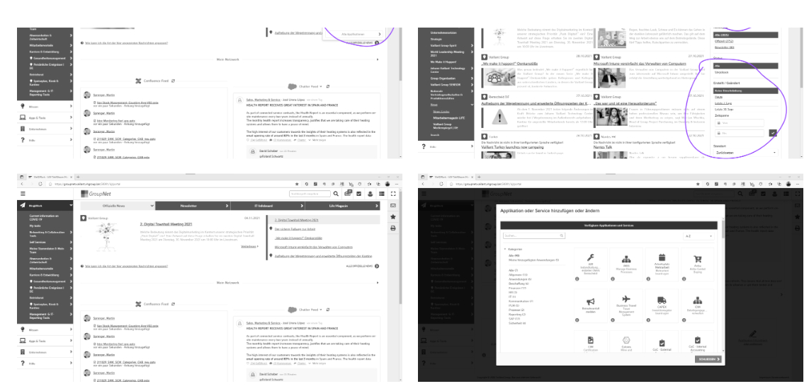
We began by auditing the existing intranet’s structure, features, tools and content, and identified user roles within the system. This baseline understanding revealed what employees valued and where frustration concentrated.
Behaviour: concerned about message control, need easy content management.
⏳ Long-term employees
Change-resistant, sceptical
Need: familiarity, minimal disruption, clear value of changes.
Behaviour: change-resistant, attached to existing workflows, sceptical of “social” features.
Workshop phase 1
What employees actually asked for.
In the first workshop round, participants wrote their needs as user stories and then voted on them. The 40-plus stories sorted into five clusters — and the vote distribution told us, before a single screen was drawn, that this was not primarily a “make it social” problem. Access and findability carried the most weight.
Cluster 1
Access & availability
Enable a user to access the Vaillant Group system landscape — content, tools, systems.
119votes
Cluster 2
Information collection & presentation
Enable a user to explore and find content, and to customise the way they receive the result.
119votes
Cluster 3
Information publishing
Enable a user to publish information in the right channel to reach the relevant audience.
80votes
Cluster 4
Networking & collaboration
Enable a user to find, connect and collaborate with other people within the Vaillant Group.
80votes
Cluster 5
Guidance & support
Provide information and tools to guide, help and support users in the digital ecosystem.
79votes
The highest-voted stories
34
2.01 · Collection“I need a flexible and powerful search across the systems I have access to, to quickly get the right, unique, most current content in a structured way — and thus save time and reduce frustration.”
33
4.01 · Networking“I would wish to have only ONE hub for collaboration instead of using Teams, Chatter, Confluence, Slack and SharePoint — to reduce effort spent searching and to create critical mass on one social tool.”
29
2.02 · Collection“I need a clear and simplified navigation structure, to see what is available and to navigate faster and more intuitively.”
27
1.08 · Access“I need to access content, tools and processes that live outside the Group Net in one place, to be able to work more effectively.”
27
2.14 · Collection“As an employee I need to personalise my homepage based on my daily working style, to focus on the content that is relevant to me.”
26
5.07 · Guidance“I need a recommendation on which tool to use for what in the system landscape, to be able to work efficiently — to avoid parallel worlds.”
25
1.02 · Access“I need a highly available Group Net, so that I can reach important work-related tools at any time.”
21
3.01 · Publishing“As a publisher I want one tool in a central hub for group-wide communication, with clear guidance — avoiding multiple isolated, overlapping tools.”
20
3.06 · Publishing“I wish to create, publish and maintain content and landing pages quickly for different functional areas, in a directly visible edit mode.”
15
4.04 · Networking“I want to be supported in networking — to get to know new colleagues who might be relevant for my job, and to grow stronger together as the Vaillant family.”
How this shaped the work: the top of the list is almost entirely about finding and reaching things — search, navigation, one place for tools, one hub for collaboration. That is what turned “search as foundation” and “network value” into the leading design hypotheses, and it is why the concept invested in information architecture before it invested in social features.
Employee personas
The generational divide.
Rather than creating “average user” personas, I developed two polarising archetypes representing the extremes of our user spectrum — ensuring our design solution worked for both ends and everyone in between.
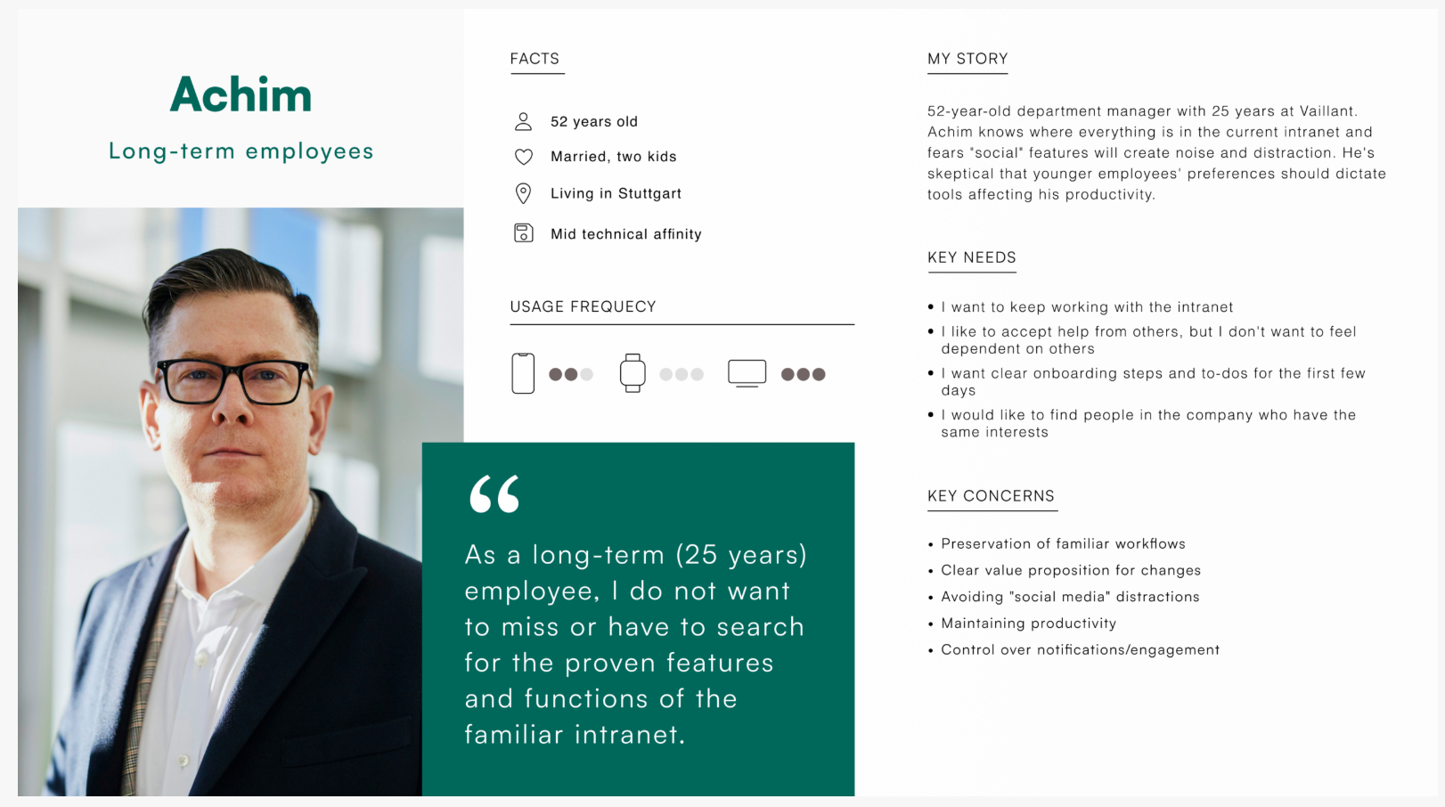
Achim
Long-term employee — change-resistant
52-year-old department manager with 25 years at Vaillant. Achim knows where everything is in the current intranet and fears “social” features will create noise and distraction. He’s sceptical that younger employees’ preferences should dictate tools affecting his productivity.
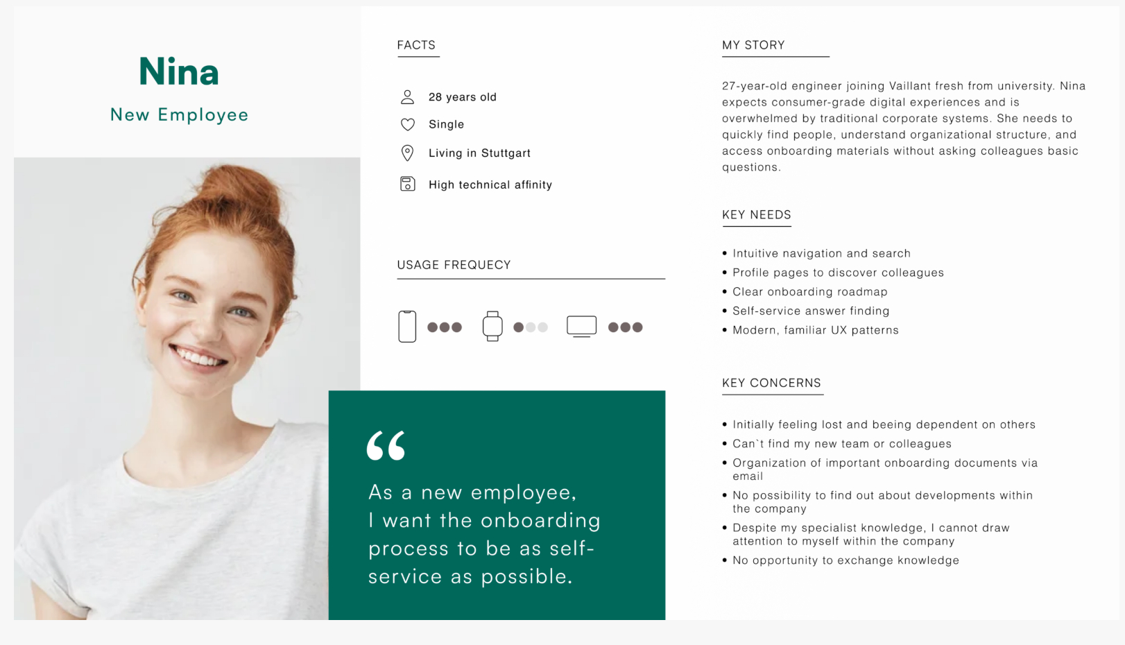
Nina
New employee — digital native
27-year-old engineer joining Vaillant fresh from university. Nina expects consumer-grade digital experiences and is overwhelmed by traditional corporate systems. She needs to quickly find people, understand organisational structure, and access onboarding materials without asking colleagues basic questions.
Design implication: the intranet needed progressive disclosure — appearing simple and non-threatening to Achim while offering the advanced social and collaboration features Nina expects. Onboarding would be crucial not just for new employees, but for existing employees learning the new system.
Employee journey mapping
Ideating the ideal experience.
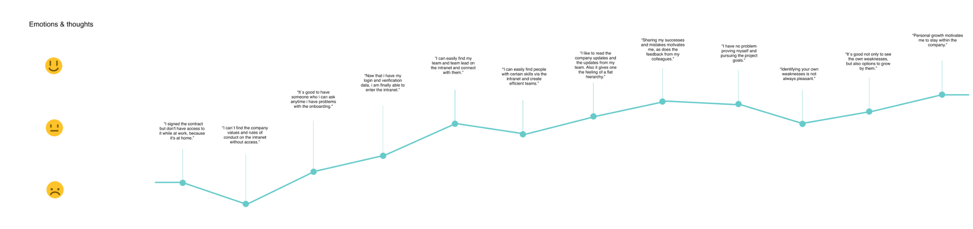
In collaborative workshops, we mapped the “ideal world” employee experience and identified opportunities to introduce social intranet features at each stage.
Key insight: the most critical intervention point is the first days of employment. New employees who successfully navigate onboarding via the intranet become advocates for the platform, while those who struggle resort to emailing colleagues and avoiding the system entirely.
Design hypotheses
Four guiding principles.
Based on research and stakeholder alignment, I formulated four core hypotheses that guided our design decisions.
Search as foundation
An employee can work efficiently if they find needed information quickly. Therefore a prominently designed, intelligent text-based search is a valuable key functionality that must be immediately accessible and highly accurate.
Network value
An employee is as valuable to the company as they are networked. Therefore smart people-search through skills and locations creates organisational value by connecting expertise with needs.
Onboarding as relationship builder
The first days as a new employee are key for long-term relationships. Therefore the onboarding process must be as simple and smart as possible, establishing the intranet as the go-to resource from day one.
Frictionless collaboration
The ability to easily exchange ideas with others and react to people’s posts is an enabling function. Therefore social interactions should be designed as easy and usable as possible, removing barriers to engagement.
03
Design: from user flows to high-fidelity prototype
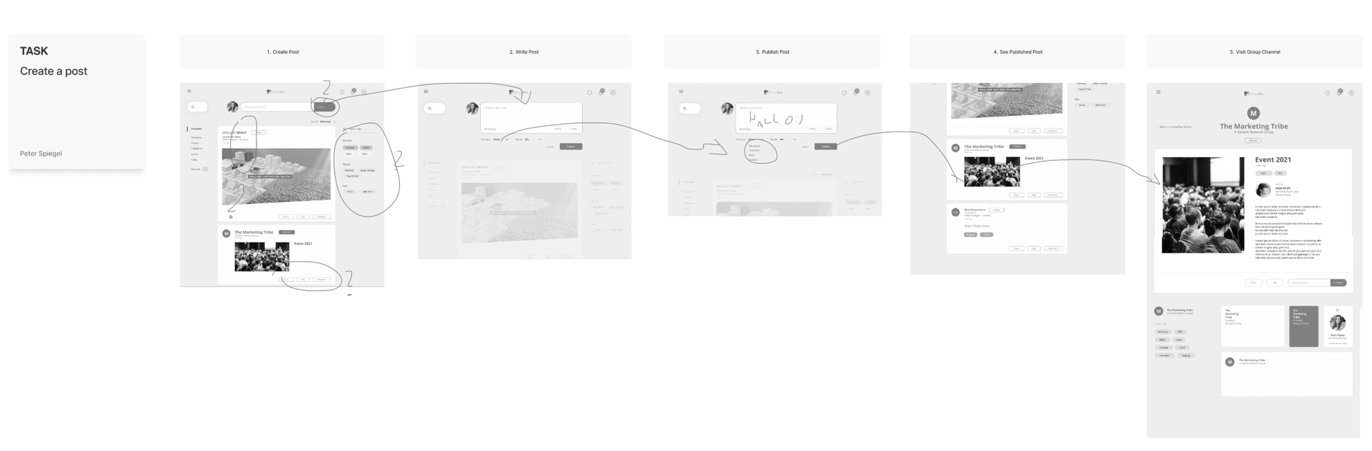
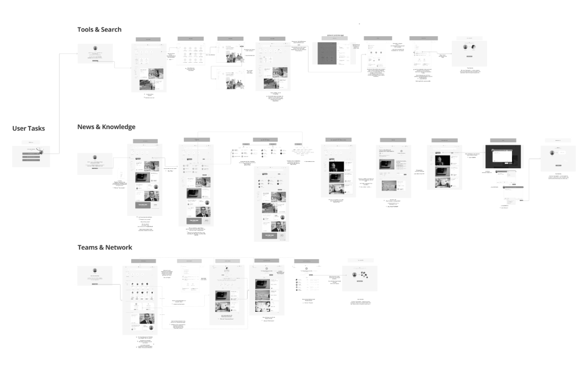
User goals were analysed as task flows, designed as wireflows, and prototyped with optimised user flows. We iterated with the team and client before testing with Vaillant employees.
Rationale for testing on branded mockups: Achim, our long-term employee persona, is already sceptical of change. Testing with grey-box wireframes would create additional cognitive load interpreting “what this will actually look like”, potentially biasing feedback. Brand-consistent mockups let participants focus on functionality and information architecture rather than visual design speculation.
Wireflow
Prototype keyscreens
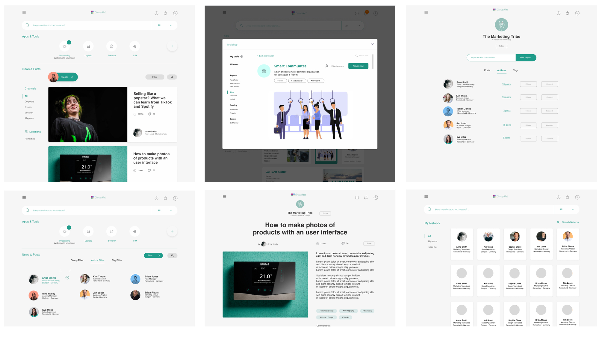
News feed, smart communities, team pages, filtered groups, article view and the people network — all in Vaillant’s brand design so participants judged function, not visuals.
04
User testing: validating with real employees
Test structure
Divided into three topic blocks, each containing around three tasks. After each block, in-depth open questions gathered qualitative insights beyond task-completion metrics.
Duration — 50 minutes per session
Participants — 7 employees
Mix — 3 office workers, 3 new employees, 1 communicator
Method — remote, one-to-one via video call
Test scenarios
Each block was named after the workshop cluster it had to answer for, so findings could be traced straight back to the votes.
Access & availability — reaching tools and applications from one place
Information collection & presentation — search, stream, filters and notifications
Information publishing — creating and contributing content
Networking & collaboration — finding people and connecting with them
Each scenario tested critical hypotheses: is search intuitive? Do people discover colleagues naturally? Does collaboration feel forced or organic? Guidance & support — the fifth cluster — had no block of its own; it surfaced through the open questions instead.
The session, minute by minute
Each of the three design models got its own task block, followed by an open interview part. A side-by-side comparison at the end let participants weigh the models against each other.
5 min
Intro
Framing and warm-up, deliberately without screens.
Participant creates their own content, then answers follow-up questions on “create”.
10 min
Model 3 — Network
Networking & collaboration
Browse the network
Add a new team member to favourite contacts
Find and contact a person with a specific skill
Job-to-be-done promptPeople + activity streamAddress book — my contactsAddress book — search / connectJoin / create group
10 min
Direct comparison
All three models shown side by side at reduced scale, so participants could weigh them against each other rather than judge each in isolation.
5 min
Outro
5 min
Buffer
Deliberately planned in — every session used at least part of it.
Key findings.
✅Search exceeded expectations
All participants successfully found information and people using search. The unified search bar became the primary navigation method, validating our “search as foundation” hypothesis.
⚠️Social features need onboarding
New employees embraced discussion forums immediately, but long-term employees needed explicit permission and examples to understand “when to post vs. email”.
✅Profile discovery delighted users
Finding colleagues by skills generated “aha moments” — participants immediately saw value in discovering expertise they didn’t know existed in the organisation.
🎯Onboarding hub reduced anxiety
New-employee participants felt “relieved” seeing a clear onboarding checklist and progress tracking, reducing the overwhelm of starting a new job.